Orange is not a shy color.
It’s lively. It’s warm. It’s confident.
It brings energy that no neutral can match. And right now, designers everywhere are obsessed with it.
If you’re tired of white walls or muted tones, orange wallpaper is your ticket to something brighter, bolder, and more exciting.
It’s not just color. Its personality. It’s sunshine you can hang on your walls.
And when it’s done right, orange transforms spaces. It makes rooms feel alive. It sparks creativity, warmth, and optimism.
Let’s dive into why orange wallpaper is having its moment—and how you can use it to completely reimagine your home or workspace.
The Psychology of Orange
Orange is powerful because it blends the energy of red with the optimism of yellow.
It’s stimulating but friendly. Warm but not aggressive.
Studies show that orange increases enthusiasm and sociability. It makes people feel energized, alert, and positive.
That’s why it’s perfect for both homes and businesses.
It wakes up a space. It motivates. It makes people want to move and talk.
When you put that feeling on your walls, you create rooms that feel welcoming and alive.
Why Wallpaper Instead of Paint?
Paint can’t do what wallpaper can.
Wallpaper adds texture, pattern, and character that flat paint simply can’t replicate.
With wallpaper, light interacts with the surface. It changes throughout the day.
In the morning, the orange glows softly. At night, it radiates warmth.
Paint just sits there. Wallpaper breathes life.
That’s why modern designers use it not just as a background, but as a statement.
The Many Shades of Orange
Not all oranges are the same.
Some are bold. Some are subtle. Each tone creates a different mood.
Here’s a quick breakdown:
- Burnt Orange: Warm. Perfect for cozy spaces or vintage themes.
- Tangerine: Bright and playful. Great for kitchens, dining rooms, or offices.
- Peach: Soft and inviting. Works beautifully in bedrooms or nurseries.
- Rust: Earthy and mature. Ideal for modern or industrial interiors.
- Copper-Orange: Metallic and glamorous. Stunning in dining rooms or entryways.
Choosing the right shade matters. It’s what turns orange from loud to luxurious.
Where to Use Orange Wallpaper
Orange is flexible when used with intention.
Here’s where it really shines:
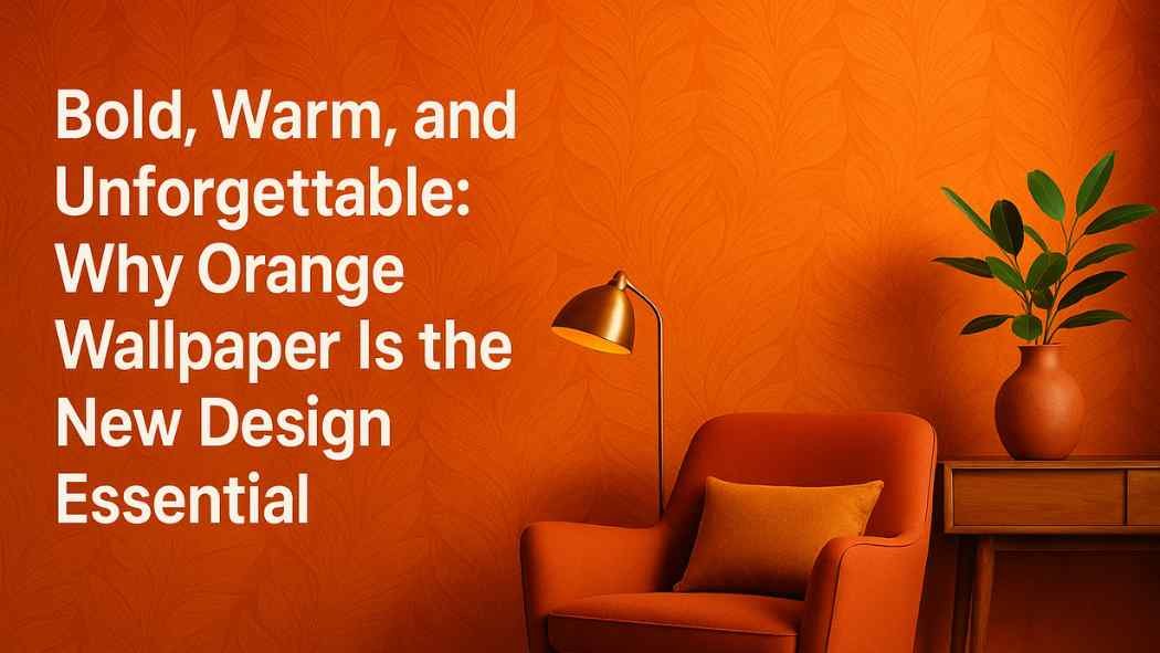
Living Room
Orange brings people together. It’s warm and friendly.
Try a patterned wallpaper behind your sofa or TV wall. Pair it with light furniture—creams, beiges, or wood tones.
Add greenery or gold accents to balance the warmth.
The result? A living room that feels modern, welcoming, and full of life.
Kitchen and Dining Room
Food and color are emotional experiences.
Orange enhances appetite and conversation.
That’s why restaurants use it—and why it’s perfect for dining spaces.
An orange wallpaper with subtle patterns or stripes adds energy without chaos.
Pair it with natural wood tables, black chairs, or copper light fixtures.
It’s cozy and stylish at the same time.
Bedroom
Yes, orange can work here too—if you go soft.
Choose muted tones like peach, rust, or terracotta.
They add warmth without overstimulation.
Use it on a single accent wall behind your bed. Pair with linen bedding and warm lighting.
You’ll get a room that feels relaxing but still full of character.
Home Office
Productivity thrives in inspiring environments.
Bright orange tones stimulate creativity.
If you’re working from home, orange wallpaper adds the spark your space might be missing.
A burnt orange geometric pattern, for example, brings energy and structure together.
Add minimalist furniture in white or oak for balance.
Bathroom or Powder Room
Small spaces love bold colors.
Powder rooms, in particular, are the perfect place for risk.
A deep orange wallpaper with texture or a metallic finish feels luxurious and unexpected.
It turns an ordinary bathroom into a statement.
Patterns That Work With Orange
Patterns shape how orange feels in a room.
You can go subtle. You can go bold. It depends on your vibe.
- Geometric patterns: Clean and modern. Great for offices or contemporary homes.
- Floral or botanical: Natural and calming. Perfect for living rooms or bedrooms.
- Abstract designs: Playful and artistic. Adds creative energy to any space.
- Textured solids: Adds depth without overwhelming the eyes. Great for smaller rooms.
The key is proportion.
If your room is large, go for bigger patterns. In smaller spaces, finer designs feel balanced.
How to Balance Orange
Orange is attention-grabbing. It doesn’t like competition.
Balance it with neutral tones and natural materials.
Here’s what works beautifully:
- White or cream: Keeps things airy and clean.
- Gray: Adds sophistication and maturity.
- Wood: Brings out orange’s warmth and creates harmony.
- Black: Adds edge and contrast for modern looks.
- Gold or brass: Complements orange perfectly for a luxurious finish.
Textiles matter too. Think soft fabrics like cotton, linen, or velvet. They tone down the boldness and add comfort.
Lighting Tips for Orange Wallpaper
Lighting makes or breaks color.
Natural light enhances orange’s energy. Artificial light shifts its tone.
Warm lighting (2700K–3000K) makes an orange glow.
Cool lighting (4000K+) makes it appear sharper and brighter.
If your wallpaper has metallic details, add accent lighting to highlight them.
Dimmer switches help you control the vibe—bright during the day, cozy at night.
The Feel of Modern Orange
Forget the retro stereotypes.
Today’s orange isn’t dated or over-the-top. It’s refined. It’s contemporary.
Modern orange wallpapers use matte textures, earthy undertones, and minimalist patterns.
They feel artistic, not overwhelming.
Pairing orange with minimalist decor makes it feel chic and intentional.
It’s not about “loud.” It’s about warmth with purpose.
For Businesses and Creative Spaces
Orange isn’t just for homes.
It’s a secret weapon for creative studios, retail spaces, and hospitality design.
Why? Because it grabs attention.
It makes customers feel good. It boosts energy. It encourages engagement.
An orange accent wall in a retail store highlights products.
In restaurants, it adds appetite and warmth.
In offices, it sparks ideas.
Color psychology meets brand experience—and orange nails both.
How to Style It Right
Here’s how to make orange wallpaper work effortlessly:
- Pick your tone carefully. Softer shades for calm spaces. Brighter tones for energy zones.
- Use accents. White, gold, black, or wood all pair beautifully.
- Add plants. Green tones balance orange naturally.
- Keep furniture simple. Let the walls lead the design.
- Test lighting. Check how your wallpaper looks during the day and night.
Small design tweaks make a big difference.
Maintenance Tips
Modern wallpapers are easy to care for.
Most orange wallpapers today are washable and durable.
Wipe them gently with a soft, damp cloth when needed.
Avoid harsh cleaners—they can dull the finish.
And if your wallpaper has a texture or metallic element, dust it regularly to keep it looking fresh.
Good maintenance means your bold design stays beautiful for years.
The Emotional Impact
Orange creates joy.
Walk into an orange-accented room and you feel it immediately.
It’s like walking into sunlight.
The color radiates optimism and comfort. It can turn a dull space into a happy one.
If your goal is to make people feel welcome, Orange delivers.
That’s why it’s becoming a go-to for modern designers who want warmth and positivity without losing sophistication.
Final Thoughts
Color sets the mood of a room.
White is clean. Blue is calm. Black is bold, but orange? Orange is alive.
It’s the color of energy, creativity, and warmth. It makes you feel something.
That’s what design should do.
Orange wallpaper brings that feeling into your home. It turns walls into expressions of personality and passion.
It’s not for the timid—but that’s the point.
If you’re ready to create a space that stands out, feels inviting, and radiates optimism, orange is the color to bet on.
Let your walls glow. Let your space speak. Let orange lead the way.